Important This feature is available only in the latest UI.
Asset layout editor refers to the Edit layout page. It allows you to customize the layout of asset pages for a specific asset type and assignment. It determines which sections, widgets, and characteristic types are shown on the Summary tab of the asset pages of a given asset type and assignment, and also the order in which they are shown. As an administrator, you can open the layout editor by clicking Edit layout on the Characteristics tab of an asset type page. The layout editor uses a drag-and-drop interface.

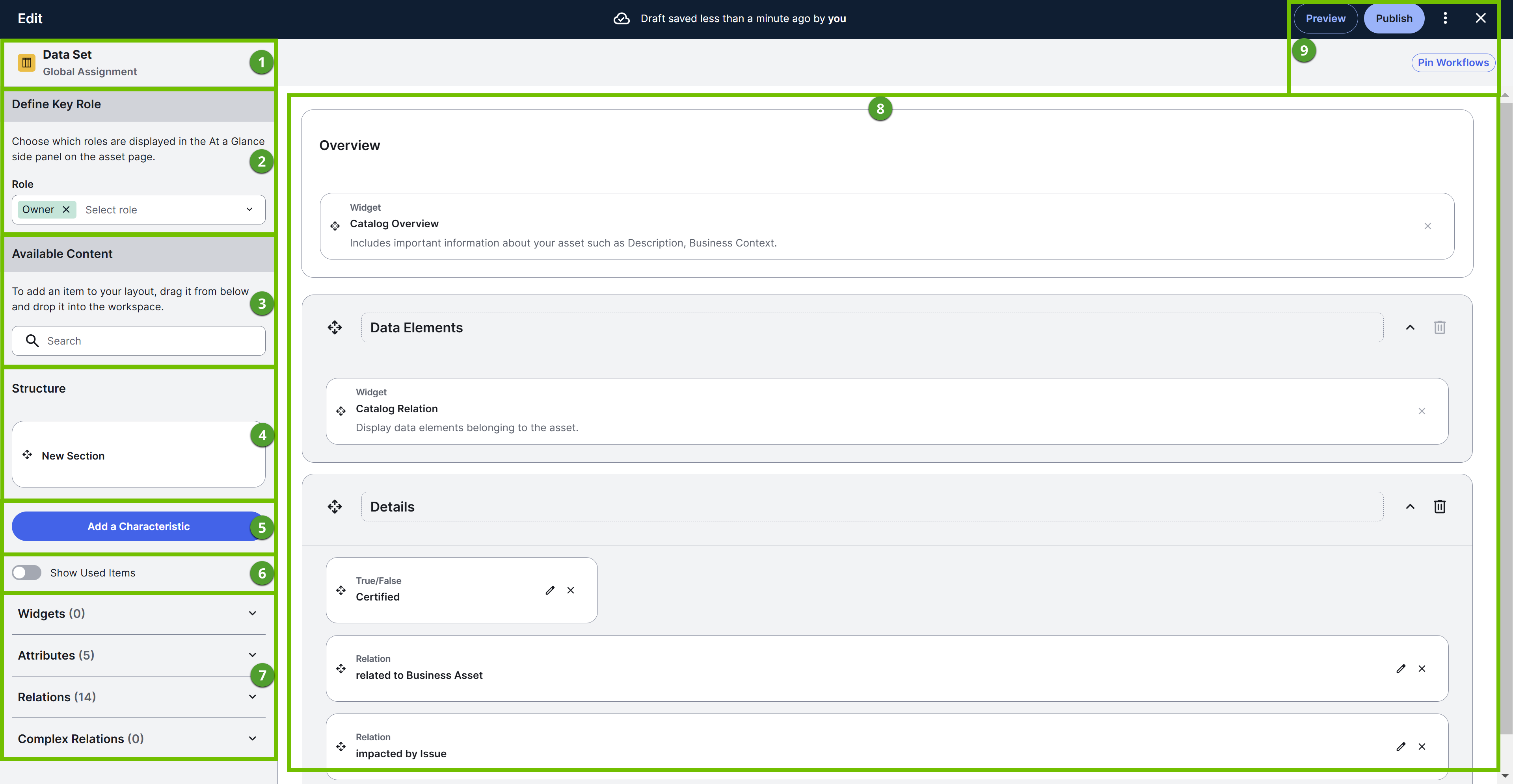
The following table describes the various sections shown in the asset layout editor, that is, on the Edit layout page.
| Number | Section | Description | ||||||||||||||||||||||||||||
|---|---|---|---|---|---|---|---|---|---|---|---|---|---|---|---|---|---|---|---|---|---|---|---|---|---|---|---|---|---|---|

|
Asset type and assignment type of the layout. | |||||||||||||||||||||||||||||

|
Define Key Role > Role |
Roles refer to the stewards responsible for the asset and they are shown in the At a Glance sidebar on asset pages. You can select or clear roles. |
||||||||||||||||||||||||||||

|
Available Content > Search box |
Content or items refer to the widgets, attributes, relations, and complex relations that are present in the left pane. You can use the search box to quickly find an item to add to the layout. |
||||||||||||||||||||||||||||

|
Structure > New Section | Sections allow you to structure the layout by grouping together widgets or characteristics. You can create a section by dragging the New Section block to the layout. | ||||||||||||||||||||||||||||

|
Add a Characteristic | Characteristics refer to attributes, relations, and complex relations. You can add a characteristic type to the asset type by clicking Add a Characteristic. For more information, go to Add a characteristic type to an asset type. | ||||||||||||||||||||||||||||

|
Show Used Items |
You can select this option to view all the items already added to the layout. Used items appear grayed out in the left pane. Clearing this option shows only unused items. |
||||||||||||||||||||||||||||

|
Items |
You can add widgets, attributes, relations, and complex relations to the layout by dragging them to the layout. |
||||||||||||||||||||||||||||

|
Layout |
A layout defines how content is structured visually on an asset page. It represents the arrangement and organization of various items on an asset page. A global assignment for an asset type inherits the layout from the global assignment of the nearest parent asset type. Similarly, a scoped assignment for an asset type inherits the layout from the global assignment of that asset type.
Editing a layout
|
||||||||||||||||||||||||||||

|
Action buttons |
Preview: Shows a preview of the layout. Publish: Publishes the layout and makes it available on all the asset pages of the current asset type for all users. Restore Default: Restores the draft or published layout to its out-of-the-box or default version. This button appears when you click Note When you click Restore Default in a dynamic layout, the default layout is regenerated from the assignment. This restores all characteristics, including those you may have previously removed from the layout, and arranges them in the same order as in the assignment.
Delete Draft: Deletes the draft layout. This button appears when you click X: Closes the layout editor without saving your changes. Pin Workflows: Allows you to pin up to 5 actions to the title bar on asset pages. Pinned actions appear as primary and secondary buttons, while unpinned actions are included on the Actions menu in the title bar. If the title bar doesn't have enough space (for example, if the asset name is very long), pinned actions are included on the Actions menu. Tip
|
||||||||||||||||||||||||||||